


Google Gradient Icon Redesign Officially Rolls Out Across Android, iOS, & Web
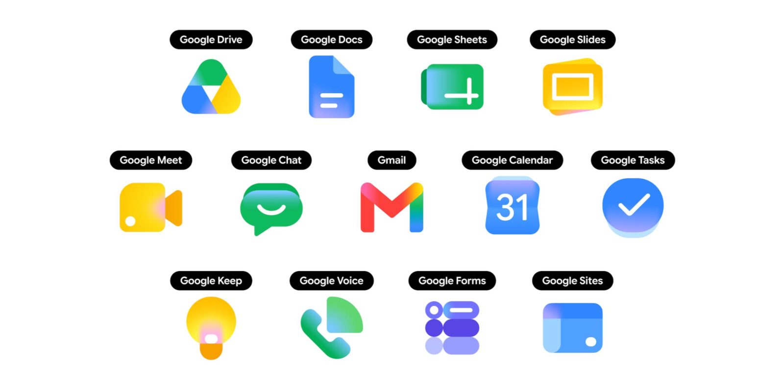
The massive visual transformation previewed just before its developer keynote is no longer an experimental server-side test. According to the latest update tracking by Abner Li at 9to5Google, the striking gradient icon redesign is officially rolling out globally across Android, iOS, and the web app ecosystem.
This aesthetic shift represents the final puzzle piece of the “Agentic Gemini Era” branding strategy announced at Google I/O 2026. By moving away from flat, hollow wireframes, Google is bringing its massive suite of productivity tools into visual alignment with its modern AI-first design language.
📈 The Rollout Status: Where the New Icons Are Live
Google is deploying the visual refresh through a carefully staged multi-platform release. If you haven’t seen your entire phone app drawer transform yet, here is exactly where the rollout stands:
  [ Web Ecosystem ]  ──► 100% Fully Completed (App Launcher & Chrome New Tab Page)
  [ iOS Devices ]     ──► Wide Availability (Rolling out steadily across App Store updates)
  [ Android Devices ] ──► In-Progress (Docs, Sheets, and Slides are live; others following)
-
The Web (Fully Deployed): The updated icons are completely live inside the Google web app launcher (the 3×3 grid in the top-right corner of Google homepages) and Chrome’s New Tab landing page. They are also appearing in the top-left corner of the web homepages for Google Keep, Forms, and Sites, though internal editor favicons are updating on a slightly delayed track.
-
Android (Actively Deploying): Android users are widely seeing the refreshed designs roll out for Google Docs, Google Sheets, and Google Slides. The remaining heavy hitters—including Gmail, Drive, and Calendar—are dropping sequentially via localized Play Store application updates.
-
iOS (Wide Availability): Apple ecosystem users are experiencing a remarkably fast rollout, with a broad segment of the core Workspace application portfolio already sporting the soft, rounded design frames.
🎨 Correcting a Historic Usability Mistake
The primary objective of this redesign is to fix the heavy criticism aimed at the previous generation of logos introduced in 2020. Under the old rules, Google enforced a strict four-color corporate mandate (forcing red, blue, green, and yellow into every single app frame). Because all the apps used identical flat colors packaged inside similar geometric wireframes, users constantly complained that scanning browser tabs or home screens was an exercise in visual fatigue.
The 2026 layout breaks those rules to prioritize immediate, scannable clarity:
✉️ Gmail (The Palette Anchor)
Gmail remains the crown jewel of the communication ecosystem and stands out as the only application that retains all four classic company colors. However, the harsh, solid blocks are entirely gone, replaced by smooth, blended gradient transitions with a soft 3D depth effect. A rich, pinkish-red dominates the shape to make it pop instantly on a display panel.
📄 Google Docs, Sheets, and Slides
The core editors have completely discarded their limiting white outer page containers, allowing the core shapes to scale larger and more dynamically on your screen. Furthermore, they ditch the multi-color clutter to focus on strong, individual gradients:
-
Docs anchors itself to a clean, oceanic blue wave.
-
Sheets focuses entirely on a striking, rich green colorway.
-
Slides steps up with an intense golden-yellow hue.
📂 Google Drive, Calendar, & Keep
Utility tools now use distinct geometries and focused color fields. For instance, Google Keep relies heavily on a vibrant yellow gradient lightbulb layout, ensuring you can distinguish it from Google Meet or Google Chat in a fraction of a second.
📊 Summary: The Generational Design Leap
| Visual Attribute | The 2020 Legacy Framework | The Modern 2026 Gradient Era |
| Color Rule Book | Strict four-color mandate for all apps. | Apps prioritize distinct, dominant single-color fields. |
| Shading Style | Flat, uniform solid blocks of color. | Soft, fluid watercolor gradients with a 3D glow. |
| Icon Constraints | Boxed inside white page/app containers. | Page containers removed; shapes float freely and scale larger. |
| Primary Goal | Corporate unity and brand consistency. | Immediate on-screen scannability and AI-era alignment. |
RELATED POST
. Google Search ads generative UI, AI booking tools and search agents
. We’re introducing new ways to design in real time with Stitch.
. I/O ’26 Recap: Everything You Need to Know
. Introducing Gemini Omni: Create Anything from Anything
. TPU Training Day for I/O ‘26
. The Gemini app becomes more agentic, delivering proactive, 24/7 help
. Fuel your next wave of growth on YouTube with Demand Gen
. Everything Google announced at I/O 2026: Gemini, Search, Android XR, & more
OTHER